-
Welcome to the Cricket Web forums, one of the biggest forums in the world dedicated to cricket.
You are currently viewing our boards as a guest which gives you limited access to view most discussions and access our other features. By joining our free community you will have access to post topics, respond to polls, upload content and access many other special features. Registration is fast, simple and absolutely free so please, join the Cricket Web community today!
If you have any problems with the registration process or your account login, please contact us.
Best ODI uniforms
- Thread starter Red
- Start date
SuperMurali
School Boy/Girl Captain
I like those Indians uniforms since 2009
Pratters
Cricket, Lovely Cricket
I have this without the side dark blues which I love.
Days of Grace
International Captain
Where are you guys getting those images of the shirt histories from? Can someone post a New Zealand one?
CharlesLara
U19 12th Man
As far as World Cup shirts go, I find it hard to go past the 1999 World Cup ones. They were consistent but also each had a uniqueness and minimilist aesthetic that gave each kit some sort of character. They also used the same numbers as the Premier League at the time which I though was pretty cool. I was always a huge fan of that NZ light blue, remember Fleming on the cover of the World Cup 99 game too in it, plus Geoff Allott probably still sleeps in his.
I'm obviously a graphic designer because I care about what typeface is used for the numbers lol.
I'm obviously a graphic designer because I care about what typeface is used for the numbers lol.
ImpatientLime
International Regular
the goat.


Attachments
-
33.8 KB Views: 2
Last edited:
ch00baka
School Boy/Girl Captain
I highly doubt that...I find it hard to go past the 1999 World Cup ones. Geoff Allott probably still sleeps in his.
https://www.youtube.com/watch?v=LkXmcJ9VyHc
Julian87
International Debutant
Agreed on the 1999 WC ones being gun. Was sort of the start of flashy jerseys in cricket and they weren't too over the top. I'm a big fan of pretty plain and distinct jerseys in all sports.
I own the Aussie 93-94, 95-96, the recent 92 wc throwback and a few of the other retro ones re-done by beer companies etc. Has to be yellow, obv.
I've always been a fan of the Kiwi kits too, until they went to all black. Loved most of the beige, grey and teal/black shirts they wore for about 13 years there until 2001 or so.
kiwiviktor81
International Debutant
I second the call for someone to post the pictures of the historical NZ kit, if possible.
sledger
Spanish_Vicente
Allegedly? He's confirmed it on various occasions. Dire bloke tstl.Not sure why we should listen to the opinions of a man that has allegedly worn pink chinos tbh
Daemon
Request Your Custom Title Now!
I wonder how he'd get along with Monk/Red Hill irlAllegedly? He's confirmed it on various occasions. Dire bloke tstl.
OverratedSanity
Request Your Custom Title Now!
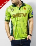
I like this one


Neil Pickup
Request Your Custom Title Now!
I've never dared to share this opinion on the grounds that I didn't think anyone else would be in remote agreement, or even understand what I was on about. So, yes. Agreed.As far as World Cup shirts go, I find it hard to go past the 1999 World Cup ones. They were consistent but also each had a uniqueness and minimilist aesthetic that gave each kit some sort of character. They also used the same numbers as the Premier League at the time which I though was pretty cool. I was always a huge fan of that NZ light blue, remember Fleming on the cover of the World Cup 99 game too in it, plus Geoff Allott probably still sleeps in his.
I'm obviously a graphic designer because I care about what typeface is used for the numbers lol.


